Black and White Processing
February 24, 2019This week we’ll address converting, and processing, your black and white images. I use software from Phase 1 called Capture 1 to process all my images regardless of whether they are colour, or black and white. There are many programs out there that can be used to convert, and process, monochrome images. Conversions can be done using Photoshop, Lightroom, Silver Efx, On One, and many more. Regardless of what program you use the principles are the same. I will go through several different examples and show the settings used for each conversion.
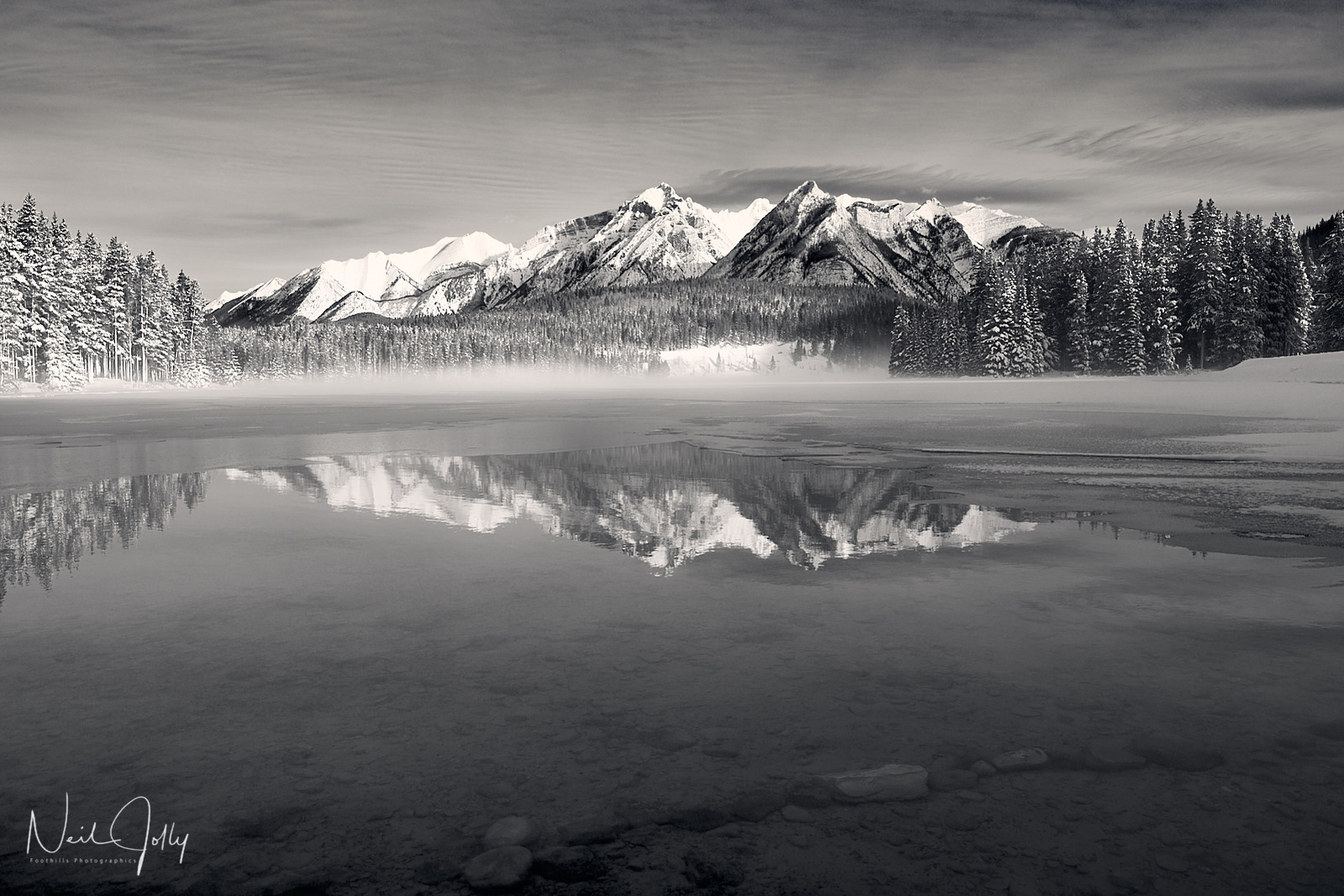
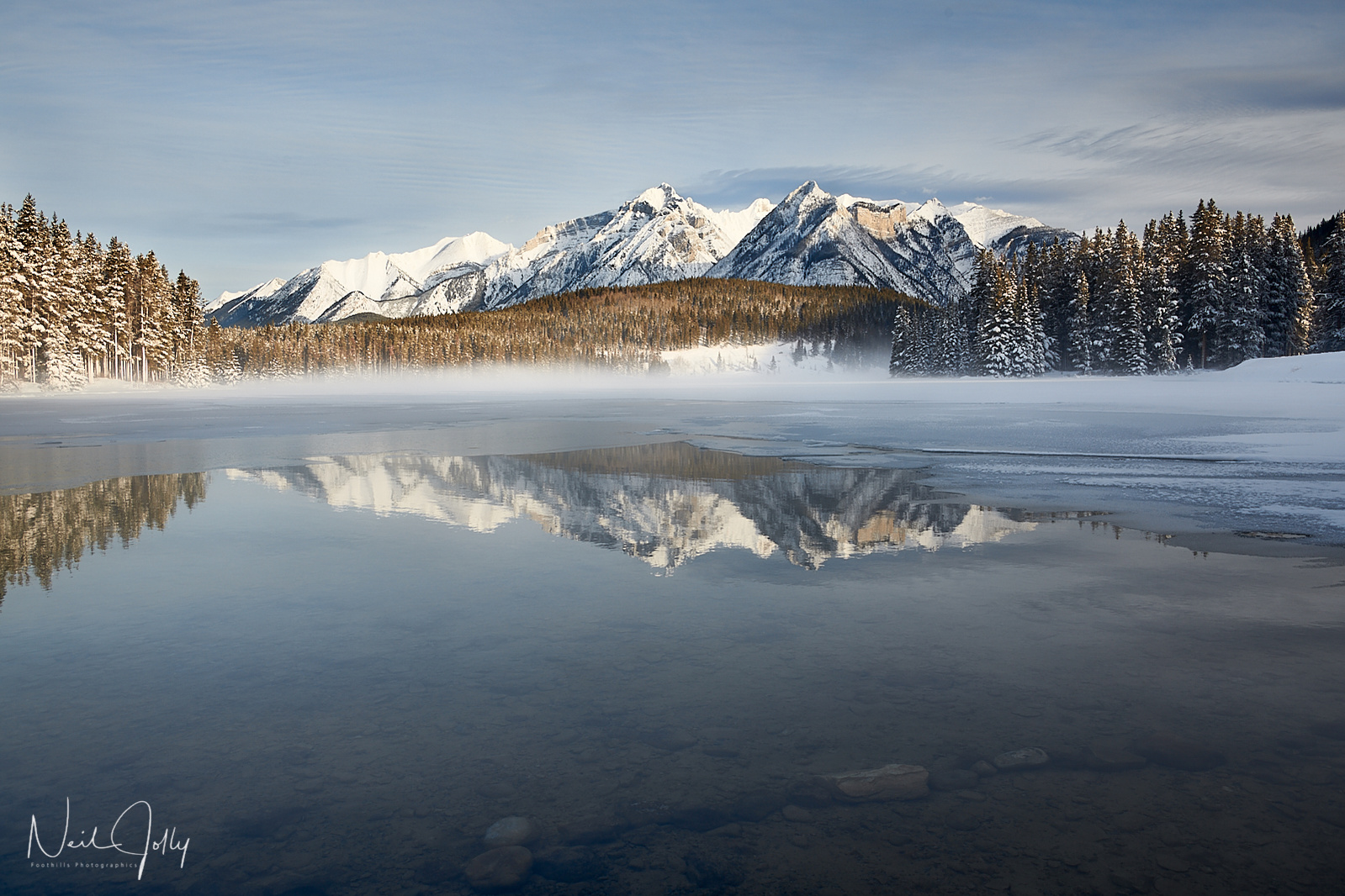
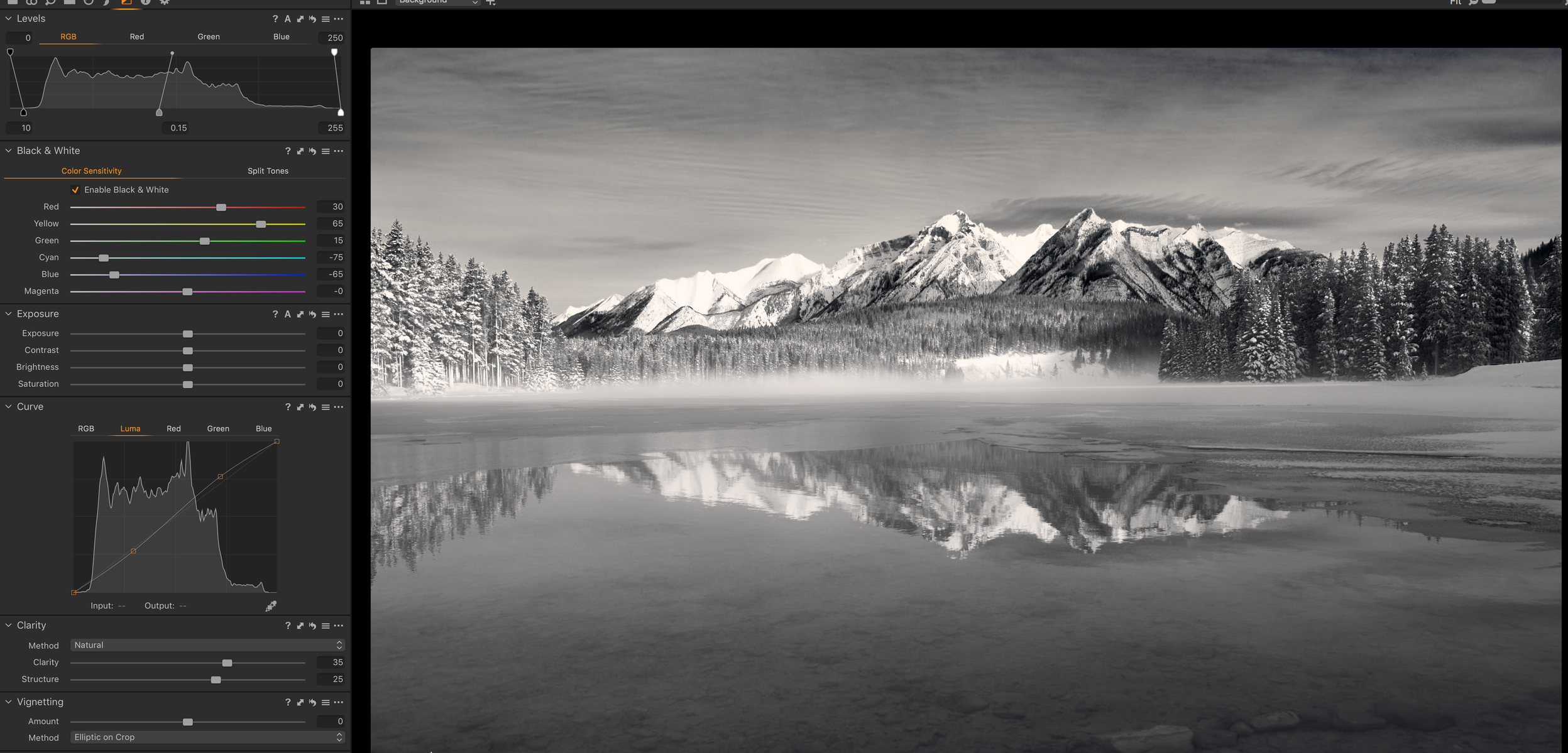
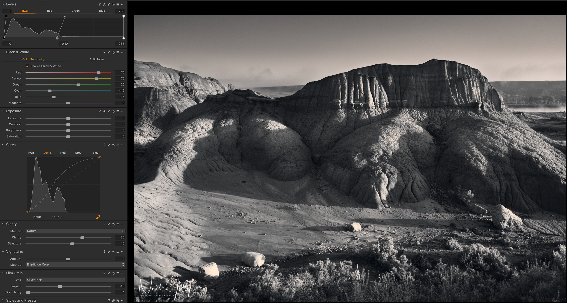
The first step I take is to process the image till it looks the best in colour. I often exaggerate the colours a bit to get better separation during the black and white conversion. Once you have the colour image looking good you convert it to black and white using the colour balance sliders. In Capture 1 converting to black and white is as simple as checking a box. Other programs will differ. You can see both versions above and the settings I used to arrive at the final B&W image. Depending on the software you use there are different methods to get to this phase of the conversion but there are plenty of more technical articles out there specific to the type of software used. Here I want to address the effect of the colour sliders. The colour sliders adjust the light sensitivity of the different colours. Moving them to the right brightens the affected colour in the image, while moving the slider to the left darkens that particular colour. A large variety of black and white conversions can result from different colour sensitivity combinations. As you can see in the image above darkening the blue tones, while lightening the yellow and red tones made the sky much more dramatic than the colour version


In the image of Peyto lake above I darkened the blue, and cyan, tones considerably to create the black sky that contrasts nicely with the white clouds and snowy mountains that contain a lot of yellow and red. Generally speaking the blue tones, yellows, and reds have the strongest effects in most images. Green tones can be used to lighten the darker forest areas, and surprisingly to many people, yellows affect most forest scenes that we see as green. I rarely use the magenta unless it’s a sunrise, or sunset, image. In addition to colour sliders you can use the curves, and levels tools to affect the image contrast but I generally try to get the contrast close to what I want just using the colour sensitivity adjustments. You can often use a lot more contrast in a black and white than you would in a colour image. Since I am using Capture 1 I have the ability to add contrast using, my prefered option, luminosity curves which affects only the luminosity of the image, not the colour saturation. Many programs allow only RGB (Red, Green,Blue) curves to be used that affect colour as well.

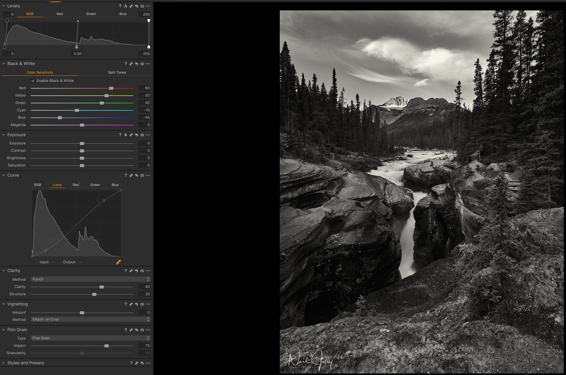
Some black and white images can benefit from adding increased clarity, and structure, to the image. Above you can see the image of Mistaya Canyon, in Banff National Park, that has lots of small detail in the rocks. Adding more clarity, and structure, to a black and white than you would use in a colour image can often result in a more eye pleasing image. Looking at the clarity, and structure, settings in both the Peyto Lake image, and the Mistaya Canyon image you will notice the change from natural to punch which has considerably stronger effect on contrast and structure. Naturally there is no right, or wrong, way to do a black and white conversion. Your final results are determined by your judgement as an artist. The more conversions you do the better you will get at it and begin to see in black and white in the field. Some things to experiment with are: adding grain to the black and white, using duotone to warm the highlights or shadows in your conversion, adding vignettes to isolate a subject, or adding contrast to specific areas using layers.